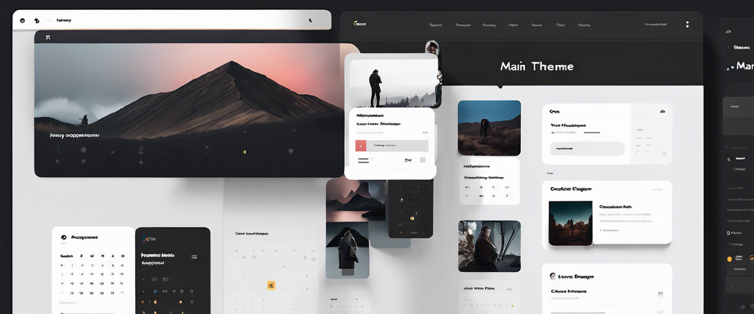
Google Calendar Introduces Dark Mode and UI Refresh
Google is stepping up its game with Google Calendar by finally rolling out a dark mode feature on its web version. This long-awaited update also includes a comprehensive refreshed user interface that aims to enhance the overall user experience.
Key Features of the New Update
- Dark Mode: Users will now be able to easily switch to a dark mode interface to reduce eye strain and enhance accessibility.
- Refreshed User Interface: The UI boasts modern buttons, dialog boxes, and sidebars that are designed to be more user-friendly.
- Improved Typefaces: The update brings in custom-designed, highly legible typefaces that comply with Google’s Material Design 3 standards.
How to Enable Dark Mode
The rollout of this update started this week, and it will soon be accessible to all users, whether they are utilizing a personal Gmail account or a paid Google Workspace subscription.
Once this feature is available on your account, you can enable the dark mode easily by following these steps:
- Click on the settings icon located in the top right corner of the Google Calendar interface.
- A new drop-down menu will appear. Look for the “Appearance” option.
- Select the “Dark” option to activate the dark mode. You can also switch back to the light mode or choose to match your device’s theme.
Impact on Third-Party Extensions
Prior to this update, enabling dark mode in Google Calendar on the web often required the use of third-party browser extensions, which could alter the appearance of the calendar. However, Google has advised users that due to the visual refresh, some active extensions may not function correctly after this update.
New Iconography and Experience
In addition to dark mode, Google has focused on providing a fresh feel to the calendar's entire web experience, including the task list view. The updated UI will feature legible and crisp iconography that enhances usability.
Conclusion
This update marks an exciting new chapter for Google Calendar users, providing enhancements that not only improve aesthetics but also foster a more intuitive user experience. With dark mode now an integrated feature, users can enjoy a more comfortable and personalized calendar experience.
Explore the new features and experience the upgraded Google Calendar for yourself!


发表评论
所有评论在发布前都会经过审核。
此站点受 hCaptcha 保护,并且 hCaptcha 隐私政策和服务条款适用。