Nintendo Unveils the Innovative Alarmo Clock
Nintendo has recently announced its latest innovation, the Alarmo clock, which not only functions as a traditional alarm clock but also incorporates a motion sensor. Priced at $100, this eye-catching device is already garnering attention, but the company has also revealed fascinating insights into the design evolution of this product through early prototypes.
Evolution of the Alarmo Design
In an insightful "Ask the Developer" interview, Nintendo showcased an early prototype of Alarmo that deviated markedly in design from the final product. The initial model featured a more rectangular shape and was available in a sleek gray color. Despite its intriguing design that included a dot matrix LED display—reminiscent of the now-retired Echo Dot with Clock—Nintendo ultimately decided against it. Yosuke Tamori, who led the Alarmo development team, explained: "We felt that this display system wouldn’t effectively communicate the instructions, particularly regarding the product’s new features, such as the motion sensor." This concern underscored the development process, emphasizing the importance of user-friendliness in product design.
Prototyping Challenges
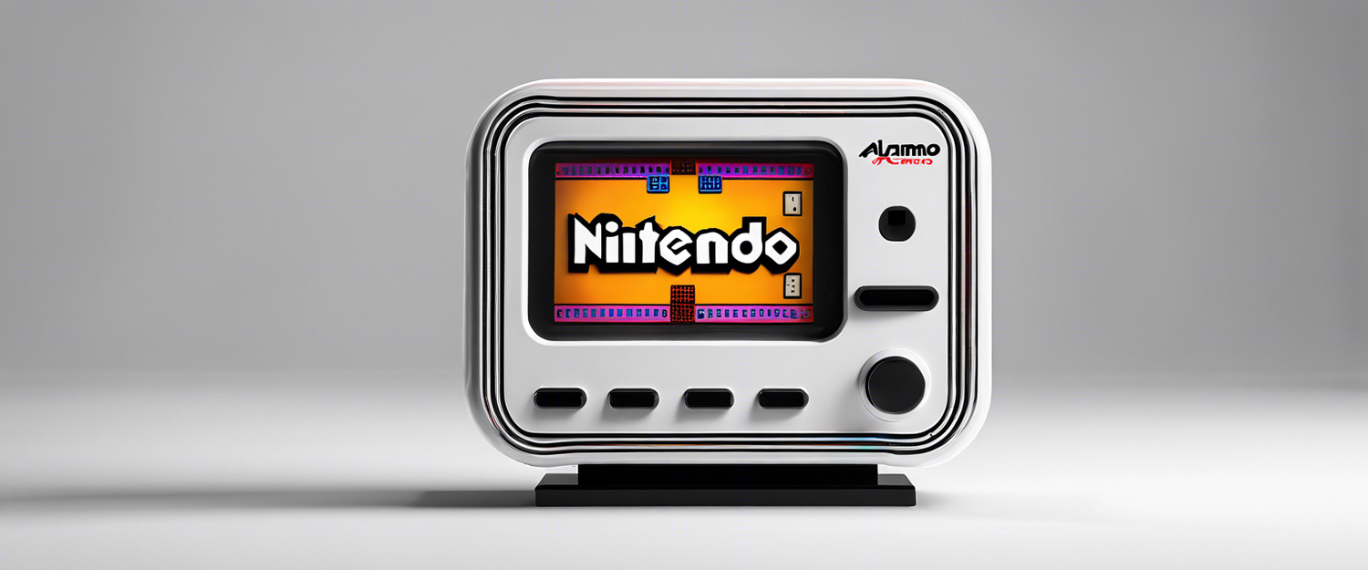
Another prototype that was closer to the final design was constructed in a manner where the system's core was placed in a pedestal base. This design included an LCD screen and speaker, with two dials—one on the top and another on the side. However, Tamori flagged a significant usability issue: "The second prototype was difficult for left-handed people to use because the dial was on the right." The team acknowledged the need for stability and user accessibility, ultimately deciding to place all controls on the top of the clock to enhance usability.
Striking the Right Design Balance
The process of designing Alarmo involved a critical dilemma: should it resemble a traditional alarm clock, or should it venture into more abstract design territory? Tamori explained, "The most difficult factor in the design decision was whether to make it look like an alarm clock or not. While it’s a highly novel product that offers a completely new experience, we thought it was important to communicate clearly that it’s an alarm clock." The final design chosen emphasizes recognizability, ensuring that users can immediately identify the product's purpose.
Unpacking Additional Features
The interview delves deep into nuanced aspects of the Alarmo's functionality, including the choice of color and why certain modern features, like gesture controls or gaming elements, were left out. Tamori made compelling arguments surrounding the practicality of these features versus the overall user experience they aimed to deliver. As he humorously pointed out, a decision against gesture controls would likely leave some tech enthusiasts feeling disheartened.
Conclusion
Nintendo's development journey for the Alarmo clock exemplifies the intricate balance between innovation and user recognition in product design. By opting for a traditional alarm clock shape, while embedding cutting-edge technology, they aim to create a familiar yet innovative user experience. As Nintendo continues to unveil more details about the Alarmo, it solidifies its commitment to offering unique products that resonate with consumers.


댓글 남기기
모든 댓글은 게시 전 검토됩니다.
이 사이트는 hCaptcha에 의해 보호되며, hCaptcha의 개인 정보 보호 정책 과 서비스 약관 이 적용됩니다.