SanDisk Rebranding: The Evolution of an Icon
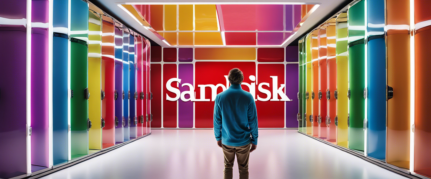
SanDisk, a leading name in the storage solutions industry, has officially rebranded itself as SANDISK or Sandisk. This new branding, announced this week, introduces a fresh logo design that marks a significant departure from the inter-capped styling that has been a hallmark of the company's identity since 1995.
A Bold New Look
The new logo is described as being inspired by "a single point of data" or a "pixel". In a promotional video, SanDisk emphasized that its "slab serif is back and bolder" while retaining an open "D" letter. The standout feature of the logo is the new pixel-driven "S", symbolizing collaboration and partnership essential for unlocking new potentials.
Strategic Timing Ahead of Spin-Off
This rebranding initiative coincides with SanDisk's upcoming spinoff from its parent company, Western Digital, which is set to occur next year. Initially slated for this year, the spinoff has been delayed yet reflects a strategic move toward making SanDisk an independent entity.
Background on Western Digital’s Acquisition
Western Digital acquired SanDisk back in 2016, but the relationship hasn't been without its challenges. Last year, the company faced significant scrutiny regarding the highly popular and expensive SanDisk Extreme SSD, where troubling reports surfaced about data being wiped from users' devices without warning. This controversy raised questions about the reliability of their products and customer support, as highlighted in a report by Fast Company.
Community Reaction and Insights
Despite these issues, consumer sentiment toward SanDisk's rebranding seems positive. Design enthusiasts at The Verge appreciate the "unfinished" look or styles that convey a modern and accessible feel. When compared to other brands like PayPal, Kia, Paramount, or Jaguar, SanDisk's new visual identity is seen as a refreshing update that aligns well with contemporary design trends.
Conclusion
As SanDisk embarks on this new chapter, the rebranding not only aims to rejuvenate its market presence but also signify its aspirations for innovation and connection with users. With the pending spinoff from Western Digital, it will be exciting to see how the new branding translates into product development and customer engagement strategy.
What Do You Think?
Share your thoughts on SanDisk’s new branding in the comments. Do you believe this change marks a positive direction for the company ahead of its spin-off?


اترك تعليقًا
تخضع جميع التعليقات للإشراف قبل نشرها.
This site is protected by hCaptcha and the hCaptcha Privacy Policy and Terms of Service apply.